| by Jay Arthur
Doctors and nurses rely on monitors to track heart rates, oxygen, and other factors in their patients. These monitors set off alarms when the indicators fall below or above certain expected levels. In the same way, statistical process control (SPC) can monitor the “health” of patient care using two key clinical indicators: the patient’s length of stay (LOS) and errors such as infection rates. It can also be used for operational indicators such as denied insurance claims.
Whenever I mention SPC for health care, nurses and doctors often say, “Isn’t that just for manufacturing?” This is a common misconception. I’ve found that you can use SPC anywhere that you have facts, figures, measures, counts, or numbers about the three demons of performance: delay, defects, and deviation.
In manufacturing, SPC helps monitor and detect when a process shifts toward making products that are off-specification, which leads to rework and scrap. Most manufacturing SPC use is aimed at reducing variation in the finished product. Using SPC in health care helps improve patient care and operations.
In 1999, a report on the quality of health care, “To Err Is Human,” was released by the National Academies’ Institute of Medicine in Washington, DC. The study estimates that hospitals cause an estimated 44,000 to 98,000 deaths per year, making health care the eighth leading cause of death in the United States. Even more will suffer some form of permanent disability due to medical errors. The Cambridge, Massachusetts-based resource organization, Institute for Healthcare Improvement (IHI) found that one out of every two patients will suffer some sort of preventable medical harm.
The IHI has launched two campaigns to improve these statistics: the “100,000 Lives Campaign” to prevent unnecessary deaths, and the “5 Million Lives Campaign” to reduce unnecessary harm. (See www.ihi.org/ihi/programs for details.)
Every year, Donald Berwick, M.D., president and CEO of IHI, asks the thousands of clinicians who attend IHI’s annual conference, the National Forum on Quality Improvement in Health Care, to “pledge allegiance to science and evidence.” In other words, it’s time to start using data and SPC to measure, monitor, and improve health care outcomes. Unfortunately, based on the scant representation of control charts in the dozens of improvement case studies displayed at every health care conference, SPC is still underused.
Here’s the good news: You don’t have to be a statistician to use SPC. With the advent of inexpensive Excel-based software to create control charts from both clinical and operational health-care data, it’s simple for even a novice to create control charts and histograms. Then it’s simply a matter of learning to read the resulting graphs. Most SPC software will point out any potentially unstable condition for analysis.
All processes vary to some degree. An aspirin, for example, may be given to an acute myocardial infarction (heart attack) patient a few minutes earlier or later than another patient. Most of the variation is due to common causes. Although one of the goals of SPC is to reduce variation, SPC is often used more in the interest of detecting special causes of variation.
If you chart infection rates in a hospital, you will find that they climb when nurses ease off procedures like washing or sterilizing their hands. In figure 1, you can see an upward trend in infections begins in December. When six points in a row increase, this trend is considered a special cause. The infection rate increased less than a few tenths of a percent, far below the detection range of our five senses. This is the power of SPC using control charts to detect problems and make the invisible, visible.

The Joint Commission for Accreditation of Healthcare Organizations (JCAHO) has developed a set of core measurements that focus on five key types of preventable deaths: acute myocardial infarction, heart failure, ventilator-assisted pneumonia, surgical infection prevention, and complications in pregnancy.
Simple protocols like giving a heart-attack patient an aspirin at arrival can help prevent heart damage and loss of life. Screening for pneumonia and vaccinating at-risk patients can help prevent infection and loss of life. When hospitals first started keeping track of issuing these life-saving treatments, less than 50 percent of the patients were receiving them. All of these core measures lend themselves to SPC. The first benefit of SPC is that measurement changes behavior.
The JCAHO measurements are just one example of clinical SPC data. The National Database of Nursing Quality Indicators (NDNQI) collects data about nursing quality. One problem NDNQI is addressing through SPC is patient falls. As seen in figures 2 and 3, measures such as falls per 1,000 patient days can be plotted using X-MR charts or u-charts.
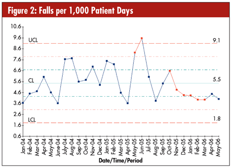

The average is 5.5 falls per 1,000 days, with an upper control limit (UCL) of 9.1 and lower control limit (LCL) of 1.8. Special causes occur in May and June 2005, and in October and March 2006.
The average range between each month is 1.4 falls per 1,000 days, again with special causes in May and June 2005.
Recent newscasts have reported great concern in hospitals regarding the increase of the drug-resistant staph infection MRSA, a strain of bacteria that does not respond to many antibiotics. The causes and the steps needed to prevent the spread of MRSA can be tracked with SPC.
There are also increasing occurrences of “never events”--things that should never happen. These include wrong-site or wrong-patient surgeries. In 2007, one hospital had three wrong-side brain surgeries. “Never events” can also be monitored with SPC.
Most of the data I’ve seen during the last decade show that health care continues to hover around a four-sigma performance level (about a 1% error rate). To achieve five or six sigma will require SPC and a commitment to following the protocols that prevent mortality and other complications.
Another health care concern involves patient length of stay (LOS). Emergency room LOS averages two hours for patients who are diagnosed, treated, and discharged. The LOS for admitted patients is more than three hours. Once the decision is made to admit a patient, the patient can be “boarded” in the ER and may wait for hours to be transferred to an available hospital bed. If the ER fills up with boarders, they go on “diversion,” which means that incoming ambulances are diverted to other hospitals. It’s estimated that for every 30 minutes on diversion, one ambulance is missed, translating to the loss of $7,000. For a cardiac-care hospital, it’s estimated that every fifth ambulance carries a patient whose bypass care is worth $100,000 or more. So, every 2.5 hours on diversion can cost a hospital $35,000 or more.
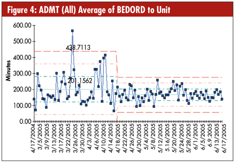
Figure 4 shows the elapsed time from when a bed is ordered for an ER patient to when he or she actually arrived in the nursing unit. As you can see, the average was 200 minutes, varying up to 436 minutes as a baseline. Improved processes reduced the average wait to 167 minutes and reduced the variation. Although these times are better, they’re still not good enough.
In 2005, the Robert Wood Johnson Hospital won the Malcolm Baldrige National Quality Award. Currently their ER LOS is 38 minutes for a discharged patient and 90 minutes for an admitted patient. They offer a 15-30 minute guarantee: see a nurse in 15 minutes and a doctor in 30. The quicker response time and LOS in their ER has brought increasing revenues each year, and another wing had to be added to the hospital to accommodate their ER admissions.
Control charts can monitor patient length of stay as well.
A control chart is a line graph of your data with an average (or median) line and lines showing one, two, or three standard deviations (sigma). These help determine stability and predictability. Most SPC software will do this analysis for you. The average and sigma lines are calculated from the data. The UCL is the +3 sigma line and the LCL is the −3 sigma line. The percentage of all data points that will fall between these two limits in 99.7 percent. (See figure 5.)

Although many quality purists will disagree, you don’t need to know the equations used for each control chart. You can look them up in a book or find them online at www.itl.nist.gov/div898/handbook/pmc/section3/pmc3.htm. In the old days, you had to calculate the limits by hand and then draw them on graph paper. When I first learned about control charts, we spent a week learning how to do each one manually. I’ve never done one since because I use software that does it for me. It’s more important to know what the chart is telling you about your process.
A control chart will tell you whether your process is out of control, unstable, or unpredictable. A stable process produces predictable results consistently. Processes that are “out of control” need to be stabilized before they can be improved.
Because a certain number of points are expected in each of the “zones” on a chart, too many points in a row in one zone may indicate a special cause at work. Each special cause needs investigation to determine if there is a root cause. A point above the UCL or below the LCL should only occur three times out of a thousand. If you’re only charting 20 data points, a point outside of the limits usually represents a special cause.
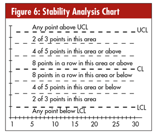
Newer versions of SPC software identify potentially unstable points or trends for you and highlight them. Common unstable conditions are shown in figure 6. There are additional rules (i.e., Nelson’s rules) that cover other conditions.
There are two different causes of variation:
• Common causes.These happen all the time, every day. For example, getting from your home to school or work takes varying amounts of time because of traffic or transportation delays.
• Special causes. These require analysis to eliminate the special cause of variation. A blizzard, traffic accident, chemical spill, or other freak occurrence would be a special cause of variation.
Any point outside the upper or lower control limits is a clear example of a special cause. The other forms of special cause variation are called “runs.” Trends, cycling up and down, or “hugging” the center line or limits are special forms of a run.
SPC software will calculate control limits using your data, and then you can use those limits to evaluate the rest of your data. If you have a process change, you can recalculate your control limits after the process change occurred.
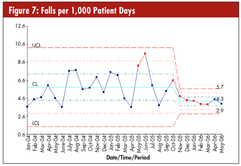
Recalculated limits will help you show the success of process improvement efforts. A change in the average or center line and the reduced variation (i.e., the difference between the UCL and LCL) shows the success or failure of a process change.
In the example in figure 7, the process improvements reduced falls per 1,000 patient days from 5.8 to 4.3, and significantly reduced variation as evidenced by the distance between the UCL and LCL.
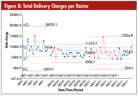
Medical doctors seem to be particularly resistant to change, but you can use control charts to compare doctors side-by-side (See figure 8.) Medical doctor No. 1 (MD1) has higher costs and more variation (caused by more complications). MD11 has lower costs and less variation (fewer complications). If you and your spouse were having a baby, which doctor would you prefer?
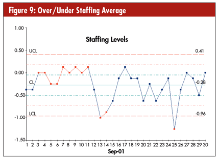
What if you wanted to calculate the number of staff on duty? You could use control charts and histograms. Figures 9 and 10 show a hospital’s staffing levels during the month of September 2001. Notice the dip after Sept. 11.
The histogram in figure 10 shows the number of shifts over/under staffed. Although this was a special month, the chart shows a slight tendency toward understaffing.

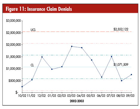
Can you use control charts in finance? Sure. Money is variable data. Figure 11 shows the denied insurance claims per month. These data show that denied claims consistently average more than $1 million dollars each month. It’s a stable, predictable process, so you can count on losing more than $1 million each month unless you change the process.
Many people hesitate to use SPC because they aren’t sure about which chart to choose. The right chart is based on the type of data--attribute (counted) or variable (measured)--and the sample size.
In health care, the most common control charts are the X-MR chart (for ratios, time, or money), the p-chart, and the u-chart for errors when you have the numerator and denominator.
In many cases the hardest part is choosing between the p-chart and the u-chart. To make this decision, I usually ask myself, “Can there be more than one (type of error) per person?” For example:
• Can there be more than one vaginal birth after cesarean per patient per admission? No. (p-chart)
• Can there be more than one death per patient? No. (p-chart)
• Can there be more than one medication error per dose?
-- Yes, if you count dosage and how it’s administered. (u-chart)
-- No, if you count medication errors as good or bad. (p-chart)
• Can a patient fall more than once? Yes. (u-chart)
• Can there be more than one error per insurance claim?
-- Yes. (u-chart)
-- No, if you’re only counting whether they are rejected or not. (p-chart)
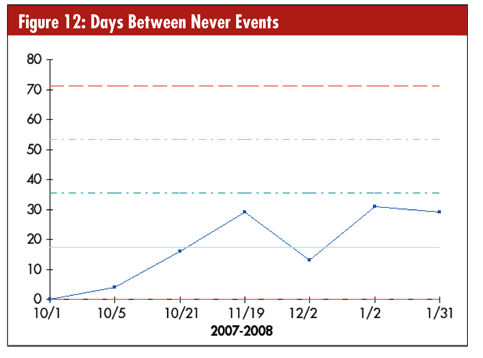
The g-chart in figure 12 can be used to analyze the time between rare events. Health care wants to reduce the number of “never events” (e.g., wrong-site surgeries). In this case, an increasing trend might be very welcome.
Given the number and types of control charts and the formulas required for each, many people avoid using control charts because of the complexity. If you have SPC software, however, you don’t need to know the formulas. Just focus on the charts and what they tell you.
Many health care personnel have created their own control charts with software using average and standard deviation. They may ask, “Why aren’t my upper and lower control limits calculated as µ + 3s (where µ is the mean and s is the standard deviation)?” The short answer is that if you have normally distributed variable data and are using the entire population, you can. These are known as Levey Jennings charts. However, when you have different distributions (e.g., binomial or Poisson for defects) or sampling the population (e.g., individuals), the math to establish the control chart limits gets a lot more complex. Newer releases of SPC software are affordable and easy to use. Stop building your own charts with inaccurate formulas.
SPC can monitor the health of clinical and operational performance using control charts and histograms. Unlike the days before personal computers and spreadsheets, you don’t have to be a statistician to draw control charts, and you can draw most charts in a matter of seconds. Software makes it as easy to draw a control chart as it is to draw a line chart, a bar chart, or a pie chart, and control charts give you much more information about stability and predictability. Isn’t it time to learn how to use SPC to improve patient safety, improve the outcome of patient care, and reduce costs in every aspect of health care delivery?
Jay Arthur, The KnowWare Man, works with companies that want to fire up their profits using lean Six Sigma. He is the author of Lean Six Sigma Demystified (McGraw-Hill, 2007) and the QI Macros SPC software for Excel.
|