When the Chips Are Down
Michael J. Cleary, Ph.D.
mcleary@qualitydigest.com
Synk R. Swymm is learning to
make charts for Deer Dairy Farms, a small firm that produces
ice cream. When evaluating the quality of the finished product,
the company insists on consistency for all the ice cream
that’s shipped. For example, inspectors examine chocolate
chip cookie dough ice cream content for the number of chocolate
chips and the amount of cookie dough in sample containers
of the product. In addition, inspectors evaluate creaminess
factors and melt temperature for each sampled container
and check the container label to be sure it accurately indicates
contents, that it’s applied straight and that the
printing is correct. This proofreading task was assigned
after a shipment went out that proclaimed the company’s
name as “Dear Diary,” so the firm is sensitive
about its image.
Swymm understands attributes charts and decided to create
a p-chart to reflect the proportion of nonconforming items
in each day’s shipments, based on a batch of 10 cartons
of ice cream. He explained p-charts to his inspectors and
sent them on their way.
However, the inspectors returned, puzzled by the data
they’d received. “We know how many are bad,
but we don’t know why,” they explained. “We’re
rejecting lots of ice cream, which our employees are taking
home to their families. They never complain about the quality,
so we don’t learn anything by rejecting the ice cream
samples.” The inspectors wondered how p-charts could
help the company improve the quality of its ice cream and
reduce the rejection rate.
Swymm assured them that after enough data had been collected,
it would be analyzed and the answer would be useful with
respect to improving quality. But as he said this, he wasn’t
sure it was the truth. How can Swymm improve the data analysis
so that it will lead to better quality?
a) Create larger sample sizes.
b) Sample more frequently.
c) Use a u-chart instead of p-chart.
Answer c is the correct response.
Like p-charts, u-charts record attributes data. But the
distinction lies in the difference between go/no-go situations,
in which a product either has a defect or it doesn’t,
and nonconforming products, which might have several defects
in a single product. The p-charts show data relating to
the proportion of rejected containers, whereas u-charts
give information about how many individual defects are recorded
in samples.
For example, manufactured parts that are the wrong dimension
and tested with a go/no-go approach should be charted on
a p-chart. Ice cream, on the other hand, might have too
many chocolate chips, a sloppy label and insufficient fill--all
in the same container. Instead of recording the ice cream
container as good or bad, more useful information would
be gathered by identifying the kinds and number of defects
in each batch of containers. This could be charted with
a u-chart and future analysis done by means of Pareto charts.
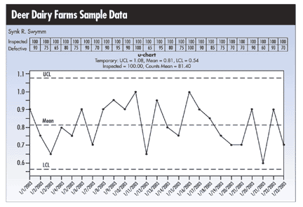
An example of a u-chart is illustrated here.
Michael J. Cleary, Ph.D., is a professor emeritus at Wright
State University and founder of PQ Systems Inc. He has published
articles on quality management and statistical process control
in a variety of academic and professional journals. His
Web site is www.pqsystems.com.
Letters to the editor regarding this column can be e-mailed
to letters@qualitydigest.com.
|
