Percentage Deceptiveness
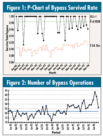
A hospital’s upper management was presented with a chart of bypass surgery survival rates--calculated as a p-chart--as seen in figure 1. It is the four-year monthly performance of the fraction of patients who were successfully treated and discharged following a primary procedure of coronary artery bypass.
 A member of the executive team who was familiar with run and control charts became concerned when looking at the graph. Even though all of the data points were between the limits, he felt that somewhere in 1994, the survival rate started to worsen, with the trend continuing. What do you think? A member of the executive team who was familiar with run and control charts became concerned when looking at the graph. Even though all of the data points were between the limits, he felt that somewhere in 1994, the survival rate started to worsen, with the trend continuing. What do you think?
There is another special-cause rule that isn’t talked about much, but applies here: The seven-in-a-row-of-the-same-data-value rule. Note that it happens twice: observations 7-15 are all 100 percent, as are observations 21-29. This test usually signals either an issue in the data- collection process or the discrimination of the measurement process.
Because the data are percentages, I have often found that a run chart of the denominators, in addition to the actual percentage performance, can be quite useful, as seen in figure 2.
It’s clear that the process had indeed changed, but not necessarily the percentage of survival. Is it the “methods” input--competence--or, as indicated by the run chart, the “people” input--number of cases?
With a 98.4-percent survival rate and a window of opportunity--or denominator--of approximately 12 to 28 (first stable process--or observations 1-33), it was unusual to see any deaths in a given month. For the most part, everyone survived. In other words, given the current survival rate and typical number of operations performed during this period, monthly data may not be discriminating enough for a meaningful analysis of process stability.
However, as of month 34, the typical number of operations increased by about 10 per month (i.e., a changed “people” process input). This new window of opportunity of approximately 22 to 40 operations, combined with a survival rate of 98.4 percent, now seems sufficient for monthly data to assess the ongoing stability of the process.
The p-chart is different from using an individual chart (i-chart), the “Swiss army knife” approximation. Given the structure of this bypass data, the p-chart is probably superior in this case. It’s only when the denominators of percentages are “large” (>50 starts to give a good approximation), that the i-chart becomes a good approximation. In this case, the denominators ranged from the teens to the low thirties, which might tax this approximation.
As Donald J. Wheeler argued in this column many years ago, and in his book, Understanding Variation: The Key to Managing Chaos (SPC Press, 2000)--a wonderful read--this p-chart may not even necessarily be correct. He makes a convincing argument that one may have no choice but to use the i-chart approximation in any case. Wheeler’s argument is subtle, and most of the time I agree with him.
In fact, I generally find this issue more problematic when the denominators are very large, as in the thousands. The resulting p-chart in that case typically contains an overabundance of special-cause outliers, and there is no choice but to reanalyze the data using an i-chart.
With such a large window of opportunity, the assumption of true randomness of the event occurring becomes suspect. Even in this current data set, the probability of the patient dying isn’t so simple: It’s actually a complex, confounded interaction between the surgeon’s competence and the patient’s actual condition, creating a predisposition to dying.
For those of you interested in a more technical discussion of this, as well as an elegant statistical alternative, take a look at the article by David B. Laney titled “P-Charts and U-Charts Work (But Only Sometimes)” at www.qualitydigest.com/july07/departments/what_works.shtml.
I will continue to make some points about dealing with percentage-type data (true “counts/counts” data) next month with a simple test to use when charts are inconclusive.
Davis Balestracci is a member of the American Society for Quality and past chair of its statistics division. He would love to wake up your conferences with his dynamic style and unique, entertaining insights into the places where process, statistics, and quality meet. Visit his web site at www.dbharmony.com.
|