Weighted Pareto Control Charts Work
by Mark L. Crossley
A client was collecting attribute inspection data and developing an impressive history on the frequency of different types of defects. A Pareto analysis was useful in focusing attention on the more frequently occurring defects.
However, these defects were not equal in their effects on the process. Some were very important and could immediately shorten the life of the product or render it inoperable. These defects were categorized as “critical.” Some of the defects were of major importance in that they lowered the performance of the product, but to a lesser degree than a critical defect. These were categorized as “major” defects. The third and final category were those defects classified as “minor.” These defects were of a cosmetic nature, such as finish and appearance, and would not affect the performance of the product.
The client had assigned a numerical weighting scale to each of these defects. The weighting, applied to each of the three categories, was directly related to the degree of severity. A critical defect was weighted as 100, a major defect was weighted as 50 and a minor defect was weighted as 5. The resulting Pareto diagram was therefore based not just upon frequency of occurrence, as a normal Pareto would have been, but rather upon frequency and the weighting factor. This assured that a low frequency of a critical defect would not be ranked lower in the diagram than a more frequently occurring minor defect. Critical issues need to take precedence.
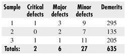
We can use these data to track the performance of the process over time. The client’s Pareto diagram is published every third day, so, in a three-month period, the client will have approximately 30 sets of data. This is an adequate amount to provide a historical data set from which we can characterize the process. We will do this not on the basis of defects/unit but rather as demerits/unit. The demerits/unit will be based upon the weighting scale. Consider the following three sets of Pareto data:

Sample sizes for these three samples are 300, 500 and 700, respectively. The corresponding demerits/unit are 295/300 = 0.98, 135/500 = 0.27 and 205/700 = 0.29.
The average demerits/unit for the demerit per unit control chart is 635/1500 = 0.42, which will represent the center line for our demerit/unit control chart.
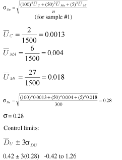
The control limits are based upon the average ± three standard deviations. The standard deviation is based upon a weighted Poisson distribution. As with all attribute control charts, the control limits will change as the subgroup sample changes.

For the first sample, the lower control defaults to zero and the upper control limit is 1.26.
The other sample control limits are calculated similarly except that the standard deviation for the second and third samples are found using a denominator of 500 for the second sample and 700 for the third sample.
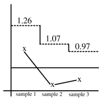
 The lower and upper control limits for the second sample are 0 to 1.07. For the third sample, the lower and upper control limits are 0 to 0.97. The completed chart is shown at right. The lower and upper control limits for the second sample are 0 to 1.07. For the third sample, the lower and upper control limits are 0 to 0.97. The completed chart is shown at right.
The control chart is in control, indicating that there has not been a shift in the performance, based upon historical data.
We now have a control chart that will allow us the opportunity to monitor the overall performance of the process. We will react to a small increase in a critical defect and dampen the reaction to a moderate increase in a minor defect.
Mark L. Crossley is president of Quality Management Associates Inc. He received a master's degree in quality assurance from California State University and a bachelor's degree in chemistry/mathematics. He is certified by the ASQ as a CQE, CRE, CQA, CQMgr. and CSSBB. He is also a Master Black Belt and the author of The Desk Reference of Statistical Quality Methods (ASQ Quality Press, 2000). Contact him at mcrossley@qualman.com, or visit online at www.qualman.com.
|