|
Many of the problems experienced when applying traditional SPC to continuous or batch processes are caused by violating the assumption of statistical independence. It's quite simple to check the assumption of statistical independence with a scatter diagram.
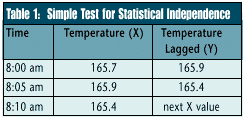
 For example, Table 1 contains the first three observations on the temperature of a solder flux bath. The first column shows the time the temperature reading was taken, the second column indicates the temperature as recorded every five minutes, and the third column contains the same data as the second except each reading is shifted upward by one time interval. For example, Table 1 contains the first three observations on the temperature of a solder flux bath. The first column shows the time the temperature reading was taken, the second column indicates the temperature as recorded every five minutes, and the third column contains the same data as the second except each reading is shifted upward by one time interval.
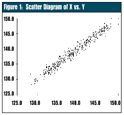
A scatter diagram will show the data in the second column on the horizontal axis (X) and the data in the third column on the vertical axis (Y). If the temperatures are truly independent, the scatter diagram will show a pattern with random scatter.
 As the diagram in Figure 1 shows, the data with a lag of five minutes are not independent. A definite correlation exists between what the temperature is "now" and what the temperature was five minutes earlier. To illustrate this, suppose the solder flux bath temperature is 165 degrees, and we turn up the bath's heat source by five degrees. The bath temperature won't change to 170 degrees instantly; it will change gradually. The solder flux process is considered "buffered." Even if the temperature at the source is in statistical control, changes in the bath temperature still will occur gradually; we say such a process is on a "random walk." As the diagram in Figure 1 shows, the data with a lag of five minutes are not independent. A definite correlation exists between what the temperature is "now" and what the temperature was five minutes earlier. To illustrate this, suppose the solder flux bath temperature is 165 degrees, and we turn up the bath's heat source by five degrees. The bath temperature won't change to 170 degrees instantly; it will change gradually. The solder flux process is considered "buffered." Even if the temperature at the source is in statistical control, changes in the bath temperature still will occur gradually; we say such a process is on a "random walk."
A traditional X and R chart or X and moving range charts won't work with data like that shown in Table 1. Figure 2 shows the temperature data plotted as X and moving range charts. Note that the moving range chart shows statistical control, while the X chart appears out of control. That's because the temperature changes are statistically independent, although the magnitude of the overall change is determined by how often the process is checked. In other words, the amount the temperature can change in five minutes is smaller than the amount of change that can appear in an hour.
Of course, the information in the moving range chart is of limited value because it doesn't tell us what the solder flux bath temperature actually is, only how much it has changed since the last time it was checked. A gradual increase or decrease in the bath's temperature wouldn't be detected by the moving range chart alone, even though the final result might be a big change in the bath's temperature.
Let me emphasize that the process shown in Figure 2 is actually in statistical control! No special causes are affecting this process. The apparent out-of-control condition is caused by using the wrong SPC tool for this batch process.
This situation can be dealt with in many ways. I'll discuss a simple method that applies to a large percentage of the cases encountered in practice. We can use the fact that the process can't change instantaneously to our advantage. Because it takes time for changes to appear, why not check the process less frequently? After all, SPC's purpose is to detect important changes, and if these don't happen during a short time interval, it makes no sense to check the process frequently.
The question arises: How long should the time interval be between samples? From a purely statistical perspective, the answer is: as long as necessary to obtain approximate statistical independence between consecutive samples.
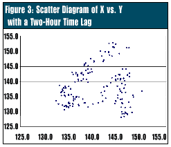
 Again, scatter diagrams can help determine how long to make this interval. As the time between samples increases, the correlation becomes progressively weaker. If the solder flux temperature is measured at a 120-minute time interval, the correlation is small enough to have relatively little effect on the X chart (Figure 3). This is found by creating scatter plots of different time intervals. Again, scatter diagrams can help determine how long to make this interval. As the time between samples increases, the correlation becomes progressively weaker. If the solder flux temperature is measured at a 120-minute time interval, the correlation is small enough to have relatively little effect on the X chart (Figure 3). This is found by creating scatter plots of different time intervals.
To arrive at a good starting guess, plot a line chart of the temperature data and determine approximately when the temperature pattern begins to repeat itself. This interval represents one complete temperature cycle and will serve as a reasonable estimate of the time lag needed for independence.
The 120-minute time interval implies that the process can be checked about once every two hours. The results could then be plotted on a traditional control chart, such as the X and moving range charts. This reduces our sampling costs by a factor of 24. With the longer time interval, a controlled process will show statistical control on both the X and moving range control charts.
This solution offers an advantage over using exponentially weighted moving average or cusum charts because most people trained in SPC already understand X and moving range charts. However, the solution leaves a two-hour gap between process samples. The fact that the observations are statistically independent means that the process can change quite dramatically during the elapsed time, although a large change may be unlikely.
If this presents a serious problem, as determined by SPC team discussions, the process must be checked more often. Because that will produce data that aren't statistically independent, the X chart can't be used. In these situations, other SPC tools, such as EWMA or cusum charts, should be considered. The more sophisticated tools can be justified by the cost savings.
Note: In Pyzdek's September column, he stated that "Running 'b' low and 'a' high decreased the average by five or six." This sentence should have read, "Running 'a' low and 'b' high decreased the average by five or six."
About the author
Thomas Pyzdek is president and CEO of Pyzdek Management Inc. E-mail Tom Pyzdek . | 
