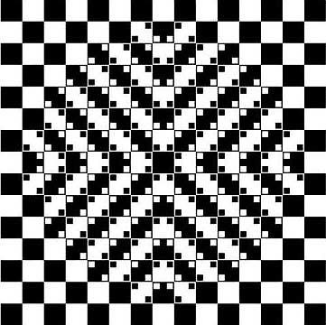
What do you see when you look at the image in figure 1? Do you see a bulging sphere that stretches the checkerboard pattern in the center, causing its lines to curve?
|
ADVERTISEMENT |
Are you sure? Look again. This time, test any “curved” line by holding a straightedge next to it.

Figure 1: Curved lines or straight?
The image is actually composed of small squares and straight lines. Yet, when perceived as a composite whole, it creates a completely different impression.
A similar “illusion” can occur when you analyze your data. It’s called the Yule-Simpson effect—or Simpson’s paradox for short.
When you look at the overall results of all your data, you see one thing. But when you look at its smaller subgroups, your conclusions are reversed.
It’s easy to be hoodwinked by this sneaky statistical illusion.
“When many are reduced to one, to what is the one reduced?”
—Zen koan
…
Comments
zen koaning
How would statistics explain Giffen's paradox that the more a merchandise is sold, the higher goes its price?
Interesting question
There are, apparently, mathematical models that attempt to explain why, at times, consumer demand for a product rises as its price goes up, defying common supply-demand logic. Japanese researchers performed statistical analysis of data on household expenditures and found that Giffen's paradox occured with the consumption of shochu--an alcoholic drink. They theorized that this paradoxical effect was likely due to the limited income of consumers, who stopped buying even more expensive items (in this case, Japanese sake) and substituted the cheaper shochu for it (even though shochu prices had also risen). http://wis-wander.weizmann.ac.il/institute-mathematicians-define-economic-paradox
Add new comment